Not a very classy move, xylortius. It is irrelevant if this mod is "dead" since it is a texture mod and its very rude to advertise your mod on someone else's page.
It is relevant if it's dead because it's not finished. This mod inspired my work. I'm not saying I'm a better texturer. I'm just trying to contribute and make it easier for people looking for a complete PipBoy retexture.
I honestly don't mind. xyloritus is right, mine isn't finished and it's just the comments section. I have 0 plans to finish this because I don't have the original files or the time to get to it. awesome to hear my little post high school project inspired you to do some work xylo. I'll check out your work and maybe throw an endorse if it's good.
That update doesn't seem to have ANYTHING to do with my mod... But I don't have access to the original account and I'm too lazy to try and find the login info. I'm honestly not sure what that update is because I don't remember adding any such thing. And the description for it doesn't really look sensible for a simple texture mod. Weird!
nice high res texture, not sure why omnis is higher than yours since it''s very unrealistic...
one question would be why do you include a second folder with textures that is outside of the data folder? those textures are also significantly different than one being used (within data folder)...
Who knows! I was pretty inexperienced with the engine/file structure. That would certainly explain why it's a large download! If I still had access to this account, I'd update it buuuuuut I don't.
I don't mean to be rude or anything, because it is certainly a better texture than the vanilla in most ways, but I don't think it's very good (or rather, I don't think it's especially aesthetically pleasing, nor does it really fit aesthetically with it's role in the world) and it certainly isn't as true to vanilla as the descriptions seems to claim. If you just look at my texture and Omni's side by side, you should be able to tell a difference immediately and pick which you prefer. They are pretty different. His is much dirtier, much darker, and less detailed. Honestly, I think Omni's is a bit flawed, in particular it's too dark, too noisy, and doesn't pull off the specular stuff very well (granted, it's a pain in this engine, which is why I think it's best to under use just in case). Again, this is very work in progress. Most of this hasn't been retextured (although the normal does add a bit of detail across the board, which helps on the less detailed spots I haven't hit yet). Hopefully when it's all done and finished, it'll be clear what sets my texture apart. But, if you can't tell the difference between them, you should probably calibrate your monitor! They are fairly different. Mine stays much closer to the original, and that'll be the case as I continue to work on the texture.
I understand. I was looking at the top left corner by the rad meter and yours didn't seem to be very clear compared to Omni's. I'll just give yours some time and try it when it is closer to finished.
EDIT: You know I did a side by side comparison just now and I have to say I don't agree with anything you just said. His is not darker, just dirtier, It's not noisy just scratched and beaten up more than yours or vanilla. His has more detailed lettering and other than the scroll wheel is very true to the original. I guess what I'm saying is I'll use Omni's until yours is done. I'm interested to see how yours improves.
The Rad Meter is plenty readable for me, and is just a cleaner, higher resolution version of the original. The one you linked has a busy, kind of garish looking meter that doesn't look like an actual meter of any kind that I've ever seen. It's overdesigned, and some people dig that, but that's not my aim. As for his being less like vanilla than mine, if you don't want to believe it, then don't. You'd be straight up wrong, because his simply doesn't stick to the original design. In fact, the Rad Meter is an excellent example of how his does NOT stick to the vanilla design. Another would be the inside of the shroud/hood around the screen, which has the same texture and material as the rest of the surfaces, despite the fact the original has it as a black rough plastic. YOu in fact list a lot of ways that it's pretty different from the original. It's so gnarly looking I don't think it even looks like it has any paint on it, or at least it's hidden beneath a thick layer of grime. There's nothing wrong with his texture just because it's not a faithful recreation, and if that is your preference, fine. I'm not calling you out for liking it more than mine. There are some people who won't use a retexture without "sweet" Call of Duty camo patterns, some who want everything to look like they have been sitting at the bottom of a lake for 4 years, then shot a few times, then set on fire, and some people like the original designs and just want to see them in an enhanced resolution. I fall into that last category. This mod is for those people, and any retextures I do going forward likely will be as well. I don't mean to be an ass, but you're clearly not looking very carefully and I don't have it in me to smile and nod at folks like you. If you don't prefer my texture, that's awesome. The reason that Nexus sites are so awesome is anyone can find whatever the heck they want for their game and customize it to their preferences. Not because you can come along and try to convince people of things that aren't true to rationalize your preferences. Just say you prefer something else, and move on! Seems you're already happy with the other retexture so I can't imagine not using mine will hurt you all that much.
I've obviously hurt your feelings; that was not my intention. I can't say that I'm sorry though after that long winded hateful reply of yours. Good luck with your modding. I hope you learn to take things less personally in the future.
I didn't take things personally at all, I was just blunt (just my way) and states things very plainly and based on fact. You were wrong duder. I don't like people pushing their incorrect statements on me or my work, and you decided to make something out of it so I made sure to stand my ground. Nothing hateful about saying "No, this is in fact X, this is in fact Y," etc. I'll take that as a victory though, as in my experience 90% of people who fall back on "you mad bro?" usually know they didn't win and think they can grasp at some semblance of a win. You were wrong, I was right, and it's my file! So I'll correct you if I damn well please. Doesn't mean I don't like you or am being "hateful." I'm just a very detail oriented, straightforward, blunt individual. If you say something isn't darker when it is, then I'll correct you. Especially when you're talking about hours of my work and trying to claim it's the same thing as someone else's hard work. Not because I care what you think about my work, but just because I don't appreciate that sort of behavior. It's completely useless and lacks any constructive purpose at all. Facts don't have emotions or motives. All I gave you were facts. His is in fact dirtier, noisier, and less faithful. And better than 90% of the retextures out there because clearly it was more than a detail texture or contrast boost. So how I managed to be "hateful" is beyond me. Until now. Although "hateful" is still inaccurate. Exasperated would be a better fit.
Chalk up one win to the butt hurt fellow MordyChaotic. May he go down in history as the self declared winner of an internet discussion about a video game texture... LOL pathetic.
Dude, I understand your argument, but you're obviously taking this way harder than you should... Mordy is trying to stay true to the original design of the Pip-boy 3000, where as Omni doesn't, at all. He doesn't care if you prefer Omni's more, but if you're going to say Omni does stay true to the vanilla pip-boy, you're flat out wrong.
---
Mordy is trying to just make the Vanilla Pip-boy Hi-Res, yet stay true to the original design.
Omni says his Pip-boy is "Hi-Res", and technically it is, but it's a different Pip-boy that he is trying to sell you, he didn't stay true to the Vanilla.
True to the original is not a valid argument here. Lets look at how this differs from vanilla:
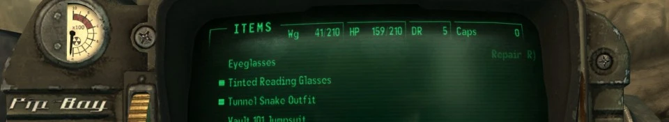
1. Rad Meter is cleaner. The gauge is too clean considering the rest of the world. 2. Wrong Pip-Boy font. 3. Wrong Stats/Item/Data font. 4. Wrong color in the area of the Stats/Item/Data lights. It's also missing the damaged paint. 5. Dark outline all the way around the knob on the bottom left. 6. Why is there rust on the right side of the screen? Shouldn't the rest of the exposed metal be rusted as well then?
Pretty much what the other two said. You want to say Omni's is more faithful? Alright, make yourself a list of all the things Omni's has done differently. It has a lot less in common with the vanilla Pip-Boy than this does.
I'm appalled that you went out of your way to actually try to tell Mordy that his retexture isn't as faithful to the original as Mordy's. That's just trying to force your (frankly, incorrect) beliefs onto other people and that's just wrong, man. You should be more polite in the future.
All of the stuff you listed is closer on mine than on Omni's lol. Are you just Omni's alt or something? Whatever duder, have fun. And the rust is from the thing being left in a heap of metal, some of which rusted and left the stain on the pip boy itself. Something I've seen happen in garages and I thought it'd add some flavor without losing the SPIRIT of the original, keeping it still looking like a Pip Boy that's just had a slightly different story, if you will.
I'd use Mordy's version when he finished it. I also have taken a look at Omni's work and found it's just a little bit too...over-designed. The texture he used for the Pipboy casing looks way too weathered and dark. Don't forget that the player has used it for merely 10 years in a mild environment (the vault). There's no way his/her Pipboy would be damaged so heavily like that. Lastly I think Omni's version failed at achieving a metallic feel, it looks like it's made of stone not metal.
Very Good Job I like How this stays true to the Pipboys Normal look yet makes it look much better
If would be cool in future updates if you could make the buttons at the bottom more Shiny?
Also I'm pretty sure this is more of my PC problem then it is with the mod but even at High settings the Pip Boys Radiation Meter looks very Blurry but the Buttons and Bottom look much better.
But its prob my PC its very very bad an I had to mess with ini Files just to get Fallout 3 to run.
I have to say, of all the Pip-Boy retextures I have seen, this is by far my favourite- really nice subtle work here.
I just opened the retextured screenshot into a new window to take a closer look (I'd advise others do that too as the windowed screenshot Nexus provides doesn't do it justice), and the subtle normal-mapping on the texture of the paint is extremely well done. That is quality work, very realistic and not easy to pull off! The font-matches are accurate too. I've wanted to do something like this myself for a while now, but it looks like I'll be downloading and using this instead. Thanks for sharing MordyChaotic, hope to see more work like this in future!
You wanna know a secret? That subtle normal mapping stuff is mostly because I added a noise grain to it (little more than generating noise, blurring it slightly, and then blending it). Just a little trick that I find works pretty well with the surfaces on the pip boy. Giving a painted surface texture is something that is rarely done right, but it's pretty simple when the engine handles subtle normal maps well. Which luckily this game does well! And the rest of the normal map stuff is just using the original texture with some masking for a few things run through a filter. Normal maps are the easy part honestly!
I just used 7zip, and I also tested unziping it before uploading it. Not sure what to tell you duder. I'll try and put it up in a straight .zip file for folks who are having compat issues here in a bit.
It's been 9 days since last update. Is it done? (I haven't DL'ed it yet to test because it's 40MB). Or is the author on a small break, or at least I hope it's a small break because this mod looks really cool and I so far prefer it over Omni's.
Hopefully the author has not been put off by some misplaced negative comments earlier, because this is a project well worth seeing through. It's important to remember that you can't please all of the people all of the time, but equally remember that you can't please some people at all.
A lot of people do appreciate good work. Hopefully it isn't the minority nit-picking view that spoils it for the rest of us, because in this case it is the minority view for a very good reason.
I have to agree with NMC I think if it wasn't for all the people who gave negative comments based on there opinion of what mod is the best then we would see a lot more talented modders coming through the nexus, your opinion is your own it never makes correct. =] and I do also hope the mod author releases an update I would love to see what it looks like when its fully finished. XD
This retexture (along with some other one's I have) has made me want to use pipboy 3000 more than ever. And it looks fantastic with ENB.
When people argue in comparison with a mod and another that's not constructive criticism that's just down right insulting.
I hope you don't let suckers get the best of you. You've made 1,812 people's day. 32 out of 1,812 are extremely satisfied. That counts as something. One of those peeps is me. I have it Endorsed, tracked and I rarely track a mod. In fact I only have 4 mods tracked.
Not discouraged at all. I have no issues taking criticism, constructive or otherwise! Work just got crazy with a big promotion, but it's slowing down so I should be able to finish this in the near ish future


66 comments
awesome to hear my little post high school project inspired you to do some work xylo. I'll check out your work and maybe throw an endorse if it's good.
one question would be why do you include a second folder with textures that is outside of the data folder? those textures are also significantly different than one being used (within data folder)...
http://fallout3.nexusmods.com/mods/8302//?
Honestly, I think Omni's is a bit flawed, in particular it's too dark, too noisy, and doesn't pull off the specular stuff very well (granted, it's a pain in this engine, which is why I think it's best to under use just in case).
Again, this is very work in progress. Most of this hasn't been retextured (although the normal does add a bit of detail across the board, which helps on the less detailed spots I haven't hit yet). Hopefully when it's all done and finished, it'll be clear what sets my texture apart. But, if you can't tell the difference between them, you should probably calibrate your monitor! They are fairly different. Mine stays much closer to the original, and that'll be the case as I continue to work on the texture.
EDIT: You know I did a side by side comparison just now and I have to say I don't agree with anything you just said. His is not darker, just dirtier, It's not noisy just scratched and beaten up more than yours or vanilla. His has more detailed lettering and other than the scroll wheel is very true to the original. I guess what I'm saying is I'll use Omni's until yours is done. I'm interested to see how yours improves.
As for his being less like vanilla than mine, if you don't want to believe it, then don't. You'd be straight up wrong, because his simply doesn't stick to the original design. In fact, the Rad Meter is an excellent example of how his does NOT stick to the vanilla design. Another would be the inside of the shroud/hood around the screen, which has the same texture and material as the rest of the surfaces, despite the fact the original has it as a black rough plastic. YOu in fact list a lot of ways that it's pretty different from the original. It's so gnarly looking I don't think it even looks like it has any paint on it, or at least it's hidden beneath a thick layer of grime.
There's nothing wrong with his texture just because it's not a faithful recreation, and if that is your preference, fine. I'm not calling you out for liking it more than mine. There are some people who won't use a retexture without "sweet" Call of Duty camo patterns, some who want everything to look like they have been sitting at the bottom of a lake for 4 years, then shot a few times, then set on fire, and some people like the original designs and just want to see them in an enhanced resolution. I fall into that last category. This mod is for those people, and any retextures I do going forward likely will be as well.
I don't mean to be an ass, but you're clearly not looking very carefully and I don't have it in me to smile and nod at folks like you. If you don't prefer my texture, that's awesome. The reason that Nexus sites are so awesome is anyone can find whatever the heck they want for their game and customize it to their preferences. Not because you can come along and try to convince people of things that aren't true to rationalize your preferences. Just say you prefer something else, and move on! Seems you're already happy with the other retexture so I can't imagine not using mine will hurt you all that much.
Regards,
I'll take that as a victory though, as in my experience 90% of people who fall back on "you mad bro?" usually know they didn't win and think they can grasp at some semblance of a win.
You were wrong, I was right, and it's my file! So I'll correct you if I damn well please. Doesn't mean I don't like you or am being "hateful." I'm just a very detail oriented, straightforward, blunt individual. If you say something isn't darker when it is, then I'll correct you. Especially when you're talking about hours of my work and trying to claim it's the same thing as someone else's hard work.
Not because I care what you think about my work, but just because I don't appreciate that sort of behavior. It's completely useless and lacks any constructive purpose at all.
Facts don't have emotions or motives. All I gave you were facts. His is in fact dirtier, noisier, and less faithful. And better than 90% of the retextures out there because clearly it was more than a detail texture or contrast boost. So how I managed to be "hateful" is beyond me.
Until now. Although "hateful" is still inaccurate. Exasperated would be a better fit.
Mordy is trying to stay true to the original design of the Pip-boy 3000, where as Omni doesn't, at all.
He doesn't care if you prefer Omni's more, but if you're going to say Omni does stay true to the vanilla pip-boy, you're flat out wrong.
---
Mordy is trying to just make the Vanilla Pip-boy Hi-Res, yet stay true to the original design.
Omni says his Pip-boy is "Hi-Res", and technically it is, but it's a different Pip-boy that he is trying to sell you, he didn't stay true to the Vanilla.
1. Rad Meter is cleaner. The gauge is too clean considering the rest of the world.
2. Wrong Pip-Boy font.
3. Wrong Stats/Item/Data font.
4. Wrong color in the area of the Stats/Item/Data lights. It's also missing the damaged paint.
5. Dark outline all the way around the knob on the bottom left.
6. Why is there rust on the right side of the screen? Shouldn't the rest of the exposed metal be rusted as well then?
And this is the closest I've seen to a good hi-res vanilla retex on the Nexus.
My argument is completely valid, stop taking it so hard. I'm not attacking you, I'm just saying you're wrong, accept it.
Okay, now:
Compare this re-texture to the vanilla, then compare Omni's to the vanilla.
Yeah, enough said.
I'm appalled that you went out of your way to actually try to tell Mordy that his retexture isn't as faithful to the original as Mordy's. That's just trying to force your (frankly, incorrect) beliefs onto other people and that's just wrong, man. You should be more polite in the future.
And the rust is from the thing being left in a heap of metal, some of which rusted and left the stain on the pip boy itself. Something I've seen happen in garages and I thought it'd add some flavor without losing the SPIRIT of the original, keeping it still looking like a Pip Boy that's just had a slightly different story, if you will.
If would be cool in future updates if you could make the buttons at the bottom more Shiny?
Also I'm pretty sure this is more of my PC problem then it is with the mod but even at High settings the Pip Boys Radiation Meter looks very Blurry
But its prob my PC its very very bad an I had to mess with ini Files just to get Fallout 3 to run.
Good Mod I hope for more Updates to the Pip Boy
I just opened the retextured screenshot into a new window to take a closer look (I'd advise others do that too as the windowed screenshot Nexus provides doesn't do it justice), and the subtle normal-mapping on the texture of the paint is extremely well done. That is quality work, very realistic and not easy to pull off! The font-matches are accurate too. I've wanted to do something like this myself for a while now, but it looks like I'll be downloading and using this instead. Thanks for sharing MordyChaotic, hope to see more work like this in future!
Can't wait for the next update!
And the rest of the normal map stuff is just using the original texture with some masking for a few things run through a filter. Normal maps are the easy part honestly!
I'm with you man.
A lot of people do appreciate good work. Hopefully it isn't the minority nit-picking view that spoils it for the rest of us, because in this case it is the minority view for a very good reason.
This retexture (along with some other one's I have) has made me want to use pipboy 3000 more than ever. And it looks fantastic with ENB.
When people argue in comparison with a mod and another that's not constructive criticism that's just down right insulting.
I hope you don't let suckers get the best of you. You've made 1,812 people's day. 32 out of 1,812 are extremely satisfied. That counts as something. One of those peeps is me. I have it Endorsed, tracked and I rarely track a mod. In fact I only have 4 mods tracked.