With that being said, we are very pleased with how well the new nav has been received, so we are now happy to roll it out for all of you.
New Site Navigation - some key changes
The new navigation is meant to unclutter the old while retaining functionality and quick access to the places you want to browse, be it mods, media, the forums etc.
While we understand that getting used to something new might take a while, we are happy to say that the overwhelming consensus from the beta survey was that the new nav is easy to use with all relevant information being laid out clearly.
That being said, there are a few new things that warrant pointing out.
More Favourites

Bringing back Mods of the Month

What is “Mods of the Month”?
Unlike “most endorsed mods” the best “Mods of the Month” are mods that received the most user votes in a given month (every user only has one vote per game, per month).
Another key difference is that any mod, regardless of release date, is eligible to become one of the “Mods of the Month” at a given point in time. However, once a mod has been voted one of the best “Mods of the Month”, it will not be eligible to be voted for again. For example your mod released in 2016 could become “Mod of the Month” in December 2019, but once it’s in the list for that month that’s it, it can’t be voted for again.
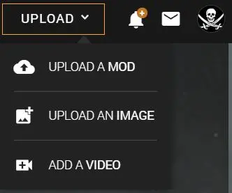
Shiny new Upload Button

The new “Upload” button in the top right stands out a bit more and can be used to directly upload either a mod, an image, or to add a video.
Community Tab

Updates moved

One of the more notable changes is that your “updates” have been moved to the top right (into the bell icon) next to your avatar. Further, in order to be more consistent across the site “updates” are now called “notifications”.
Clicking your avatar/user icon in the top right will allow you to access your profile, wallet, and user settings.
Small changes since the beta
Almost 2,500 of you have taken the time to provide valuable feedback. We listened to what you had to say about the new nav and our design team has taken some of your suggestions on board.
- We brought back a link to browse all mods (mod tab).
- Mod categories have been added back to the mods tab.
- The colour scheme for the games is back.
Lastly, we made a slight change to the nav when it comes to how you access the homepage (nexusmods.com) vs. the game homepage (in this example nexusmods.com/skyrim) and your favourites:

What’s next?
Going forward, our design team will be focussing on improvements to the overall layout of the site including a new homepage, game homepage(s), and mod pages. As with the navigation, once we are ready, we are going to release new features through the beta version of the site so we can test new ideas and get your feedback on them.
We will also be testing the current colour scheme with the new navigation to ensure it passes accessibility. This may bring an opportunity to add more colours.
With that being said, we sincerely hope you guys will enjoy the new site navigation and we are looking forward to adding more features and improvements.
Please, feel free to leave a comment and tell us about your thoughts and experience once you have had some time to try it out.


388 comments
Comments locked
A moderator has closed this comment topic for the time beingPlease keep your comments relevant to the new navigation in the header. Thank you.
Thank you in advance for your answer.
Only thing I personally find 'unsatisfactory' is the amount of favourite games. That should be at least a hundred *cough*. Well, maybe twenty-five or so. Personally I don't need a ribbon menu with all the covers of the games. A roll-out menu with an alphabetical list would suffice. But that's just a minor thing. I keep bookmarks to the relevant games in Chrome anyway.
A job well done, me thinks
Too much egg nog mayhap?
Just off the top of my head:
I reiterate the earlier poster's comment about not using my full screen width. Over half my screen is just the background picture.
Download history should at least list the game it was for with all the other information.
Search by category shouldn't be a refinement of a completed search, it should be a main type.
On individual mod screens, the user last downloaded date info should be right next to the last uploaded info.
I mention all this here because I'm not sure where would be more appropriate.
a) part of a background picture
b) larger or smaller grey part depending on zoom level
c) Text area
d) larger or smaller grey part depending on zoom level
e) part of a background picture
f) Minor: Even on high zoom level no vertical bar
h) elements on the page disappearing on higher zoom level
So I just can't afford this premium service. So I go here with the side bars and the top bar reminding me that my downloads will be slow. Sure I get that. I expected that. But then having the ANNOY TO PAY "features" on the site doesn't exactly encourage me to want to pay. In fact it just pisses me off.
Thought I would throw my two cents in on that issue.
Edit: I'm going to throw these last three things out there as well.
1. I can live with a 5-10 second delay on the download. Won't like it, but I can live with it provided there is a visible timer counting down.
2. The new "Push for Premium!" (TM) that is going on with the downloads is LESS likely to get me to go premium and more likely to make me think twice about downloading, voting or endorsing mods. I realize that is actually good for Nexus as it reduces their load, but it also reduces traffic and income when that is hundreds or thousands of people who are no longer seeing the ads they post on every page.
3. And I'll step up and admit that maybe I'm wrong about the hows and whys; but whether I am or not it sure as heck looks like the admin (site admin, not the moderators) lording the premium memberships and pushing them hard on the regular user base. And anyone in politics, business or marketing will tell you that it's all about perception.