


0 of 0


About this mod
I started playing through AC: Odyssey a while back, and felt like I should go back to where my obsession with Assassin's Creed began, Assassin's Creed II.
Hence, I figured I might as well make another ReShade preset, especially since there don't seem to be a lot of them for some reason.
- Requirements
- Permissions and credits
- Donations
NOTE: Sky is now perfectly blue, rebalanced the colors a bit. Replaced the old comparison pictures.
If you downloaded the older version, please consider updating.
NOTE: Just finished rebalancing the colors again. Both pre-sets are now appropriate for every city, I think (I haven't checked Rome yet).
All the pictures above match the new version, a few pictures below still need replacing.
As of now, the only change I see myself making in the future is getting rid of the occasional red skies, if I can do it without making too big a negative impact on the rest of the environment.
They don't occur that frequently though, so I'll just have to wait it out.
IMPORTANT: If you downloaded the previous version, please switch to the newer one if you plan to use this ReShade in Venice, it will look like shit otherwise.
VictoReShade
A Two simple pre-sets, made by a guy called Victor.
Effects used:
- AdaptiveSharpen.fx
- AmbientLight.fx
- ArtisticVignette.fx
- Clarity.fx
- ColorLab.fx
- Colourfulness.fx
- Curves.fx
- DPX.fx
- EyeAdaption.fx
- FakeHDR.fx
- GaussianBlur.fx
- Levels.fx
- LiftGammaGain.fx
- PiecewiseFilmicTonemap.fx
- Sepia.fx
- Technicolor.fx
- Technicolor2.fx
- Tonemap.fx
- Vibrance.fx

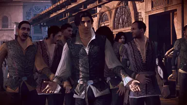
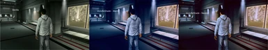
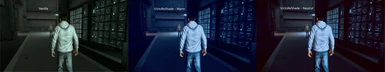
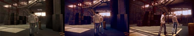
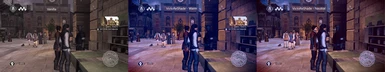
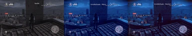
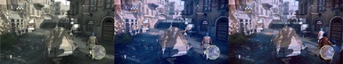
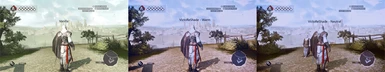
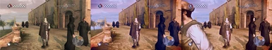
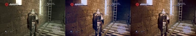
VictoReShade for Assassin's Creed II contains two pre-sets. A warm pre-set, and a neutral one.
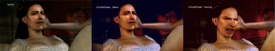
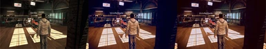
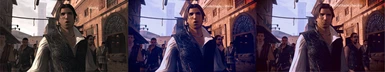
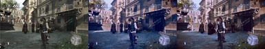
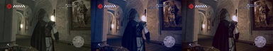
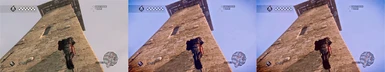
The first picture in this thread is using the warm pre-set, you can tell by how shadows consist of deep shades of blue.
The second picture, right above this text, is using the neutral pre-set.
The neutral pre-set will often feel more realistic, but for some reason I kept finding myself wanting to switch back, that's why I decided to include them both.
Note that the 'warm' preset doesn't make warm colors that much warmer (at least compared to the neutral pre-set), it just makes cold colors a lot colder.
I just named it warm because the difference becomes more apparent.
How to install ReShade:
- Dowload the latest version of ReShade from here.
- Run the Installer -> Select your game directory -> Select Direct3D9.
- Uncheck all and let the installation finish.
- Extract the pre-sets and the reshade-shaders folder to your game's main directory.
- After launching the game, press 'HOME' to toggle the ReShade overlay.

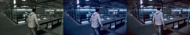
I tried not to stray too much from how buildings look in Vanilla, since that's one of the things I like about this game, but rather tried to visualize how they would look if subjected to proper lighting. That, the fact that there's a dull grey vibe everywhere you go, and the fact that the sky is literally grey at times in Vanilla, were the primary things I intended to 'fix'. Now that that's all done, I'm pretty sure I'm done making changes.

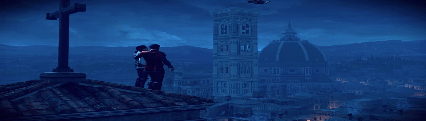
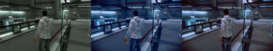
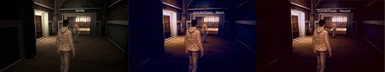
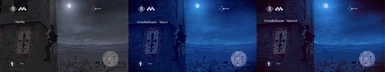
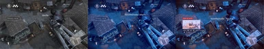
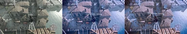
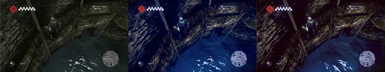
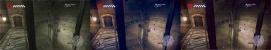
Above is an example of what the sky usually looks like at night in Florence, playing Vanilla, compared to how it looks using one of my pre-sets.
As you can see, they chose to go with a grey color that makes you feel like you're dead inside. Which would be fine, if during the day they didn't at times make that same damn grey sky exude unfiltered brightness as if it's the middle of summer. I thought it would make more sense to have the sky be blue, than to pretend it's always shit weather.
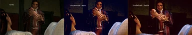
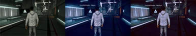
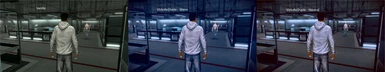
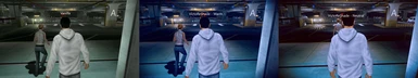
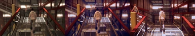
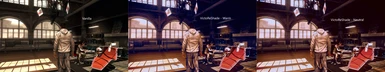
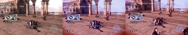
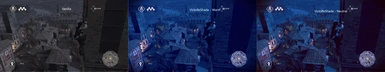
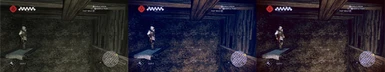
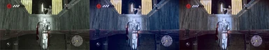
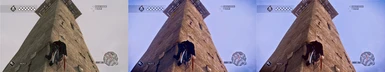
The picture above does a great job at showing the differences between the two pre-sets. Warm has colder blue shadows that, in my opinion, add to the overall ambiance, while the neutral preset has rather grey-ish shadows that more resemble Vanilla and reality, but difference between light and dark are still more accentuated.
As you can see, they chose to go with a grey color that makes you feel like you're dead inside. Which would be fine, if during the day they didn't at times make that same damn grey sky exude unfiltered brightness as if it's the middle of summer. I thought it would make more sense to have the sky be blue, than to pretend it's always shit weather.
The picture above does a great job at showing the differences between the two pre-sets. Warm has colder blue shadows that, in my opinion, add to the overall ambiance, while the neutral preset has rather grey-ish shadows that more resemble Vanilla and reality, but difference between light and dark are still more accentuated.
I personally prefer the warm pre-set, but since that preference is not only subjective but also circumstantial, I thought it better to upload both pre-sets.
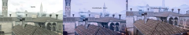
Here's what the Florence sky usually looks like during the day.

Right now seems like the right time to point out how staring at water should never result in observing the color grey.
I'm genuinely baffled by how a large group of grown people can come together and be collectively unaware of this simple and constant fact.
I'm genuinely baffled by how a large group of grown people can come together and be collectively unaware of this simple and constant fact.

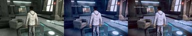
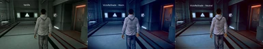
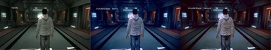
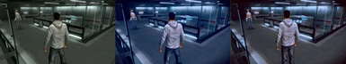
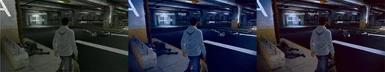
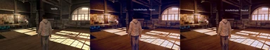
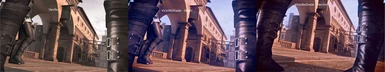
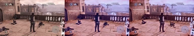
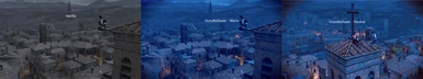
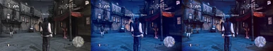
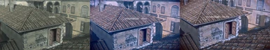
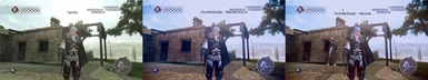
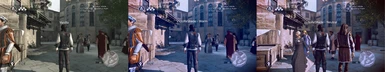
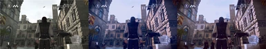
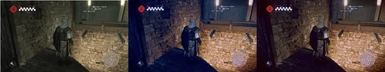
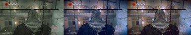
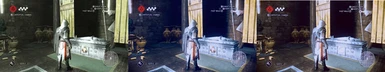
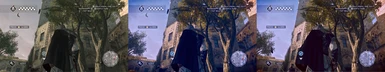
Here's a look at Florence's streets from lower ground during daytime.
As you can see the difference between warm and neutral becomes quite apparent when looking at shadows.

I guess what's better is a subjective matter, but I feel like the Warm pre-set adds to the overall feel of the game in most scenario's, even though the neutral pre-set resembles reality more accurately.

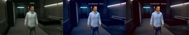
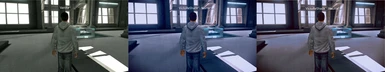
I should probably also mention both pre-sets have 2 versions, a regular version where sharpening and blurring match 4k, and a 1080p version.
The .rar archive contains all files, though. No need to download any optional files.
The .rar archive contains all files, though. No need to download any optional files.

Also, I can't speak as to any performance loss, since the monitor I currently use only has 4k30hz and 1080p60hz, both are always capped either way.
Low end rigs will probably notice a difference, though.
That being said, this is an extremely old game with minimal system requirements.
I'm sure most computers able to run games from this day and age will have 0 problems using this.
I'm sure most computers able to run games from this day and age will have 0 problems using this.

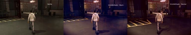
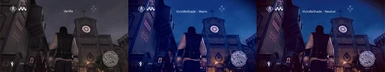
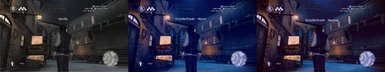
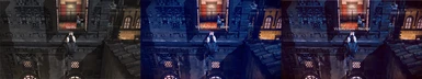
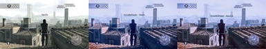
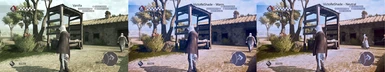
Here is the new look of Monterrigoni, one of the skies I usually dislike most. It didn't happen to look so bad this time, for Vanilla standards, but I didn't feel like waiting around for it to turn to shit. The difference is still as clear as night and day, anyway.
(Old picture, will be replaced once I re-visit Monterrigoni.)

I might as well use this opportunity to point out how amazing it is a person had the amount of irreproachable stupidity necessary to be capable of mistaking not only the sky, but also the water for being grey, while at the same time managing to survive growing up without dying by forgetting how breathing works.

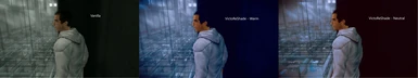
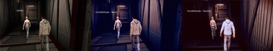
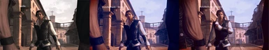
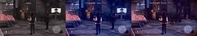
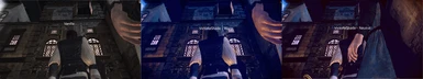
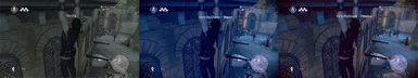
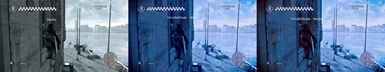
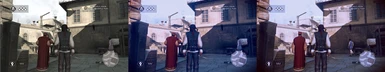
Trust that the sky you see behind this man didn't use to be blue.
It took some effort to get the sky properly blue without getting all the other colors off balance, but I did the best I could.
It took some effort to get the sky properly blue without getting all the other colors off balance, but I did the best I could.
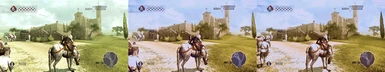
Let's continue with Tuscany.
First up a few scenes of the farmland.

As you can see, the colors are quite a bit more lively than before.
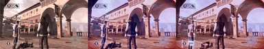
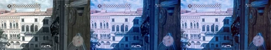
Same goes for the buildings in Tuscany, including those in cities.
I'm running out of relevant things to say, that being said, I can't break format.
When you look at them closely, some of the textures in this game really aren't that bad, so why pick such bland colors? 
I probably don't have to mention how any of the big pictures are not Vanilla but I'll do so anyway.

Also, I mentioned earlier how the 'warm' pre-set features cold blue shadows, but nights look blue either way now, not grey.
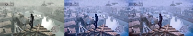
In fact, when not comparing shadows or reflections, it's hard to discern any difference at all.
In fact, when not comparing shadows or reflections, it's hard to discern any difference at all.

As it is now, the only change I see myself making are fixing the red sky which sometimes appears in the game. I'll have to wait for it to re-appear before I can adjust my pre-sets though.
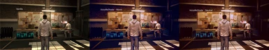
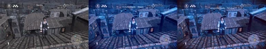
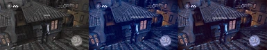
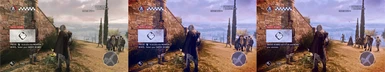
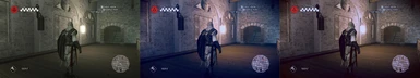
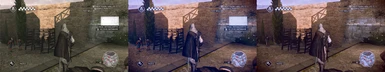
Let's continue with the streets of Forli, still looks pretty decent. Shadows are hella prominent.
(Old pics too, will be re-visiting Forli soon.)
(Old pics too, will be re-visiting Forli soon.)

Same goes here, as usual, the neutral pre-set often ends up looking slightly better during the day.
As you can see, Forli looks quite alright with this ReShade, but I'm still unsure if I'm completely satisfied.
As you can see, the sky is already quite blinding in Vanilla, it's still grey for some reason tho..

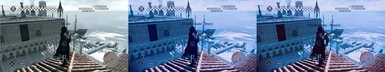
Here's one last picture of Forli, before continuing to Venice.

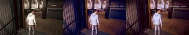
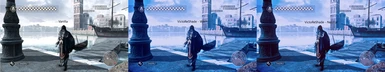
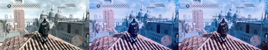
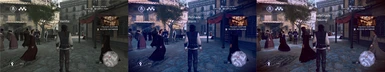
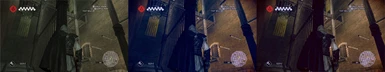
As you can see, for some reason, against all logic, someone decided to finally add a tiny ass tint of blue to the game.
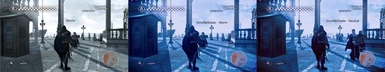
Now me blue'ing it up has made nights/early mornings in Venice quite blue.
It doesn't look that awful, but it definitely needs a few touch-ups. Inconsistencies like these are frustratingly illogical, the person responsible for this should be named so in the future no one makes the mistake of taking anything they say or do seriously..

Note that this is the newer version, it used to be even more blue :X.
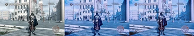
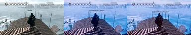
Luckily daytime looks a lot more natural, I'll have to try to re-balance this one time with Venice in mind to get it better, but right now imma focus on actually playing through the entire game.

As you can see, them blue'ing venice up has made the distinguishable differences between the two pre-sets even smaller. You can still see a difference if you look closely at Ezio's cape or shadows on buildings, but it's not something you'd soon notice when switching your focus between the two pictures.

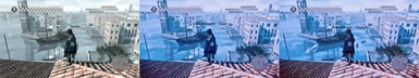
Maybe it's the surplus of water, maybe it's just me, but I still feel like Venice is slightly too blue, may be up for change in the future.

That being said, I like the feel of the current pre-sets, especially the warm one which relies heavily on blues, so I won't make any changes to upset that balance.

If you have any question or suggestion you can leave a post tho, but I'm not always active.