Oblivion
Nehrim

Image information

Added on

Uploaded by

seeberg

About this image

Notice

This user's image description contains 1 images. Some authors like to showcase more of their work in their image descriptions or use the image description to provide a storyboard for the image provided.

You will need to be logged in before you can see this user's image description.

7 comments

  1. Gwanuneg
    Gwanuneg
    • member
    • 97 kudos
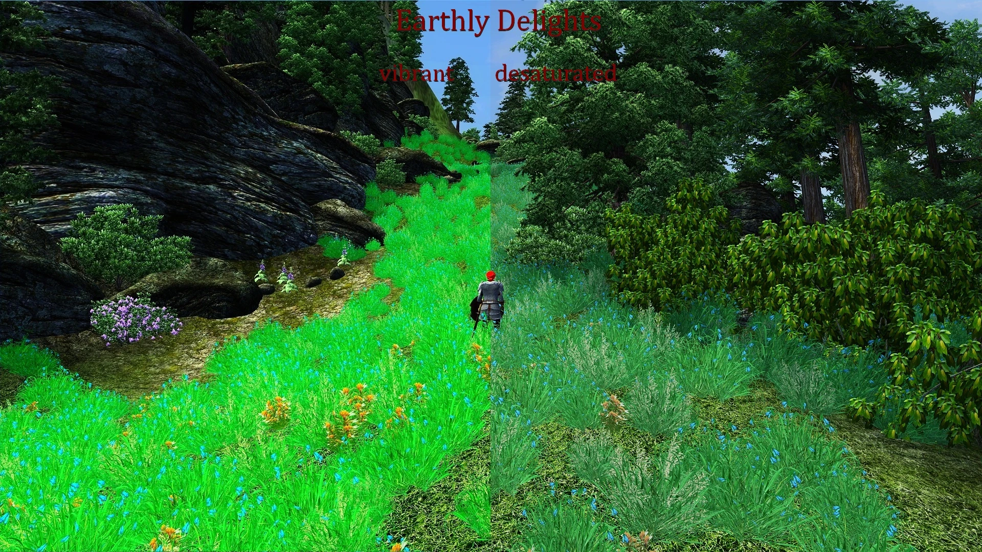
    Despite the fact that I really love the bright, festive colors, lately, I have come to prefer less intense setting. I would love to have in my game setup screen, close to realistic, but alas! I can not find a suitable option ENB.
    Therefore, in your case, I choose less saturated.
  2. maczopikczo
    maczopikczo
    • member
    • 206 kudos
    For me even the desaturated version looks a little oversaturated but it may be a matter of personal settings. What would be great now is a comparison between vanilla and desaturated version...
    1. seeberg
      seeberg
      • supporter
      • 14 kudos
  3. papp263
    papp263
    • supporter
    • 159 kudos
    ...
    Again, for me the right side would be my preference...
    1. seeberg
      seeberg
      • supporter
      • 14 kudos
  4. TesaPlus
    TesaPlus
    • premium
    • 69 kudos
    For my setup, too, the vibrant version is too bright ( haven't downloaded that one yet ). But look at Discovery1's screenshots ( Imperial Ecologies as well ): In his setup it looks just as I would like to have it in mine ... but I can't get there, even with OR's in-game configuration tool **tantrum** .
    1. seeberg
      seeberg
      • supporter
      • 14 kudos