About this image
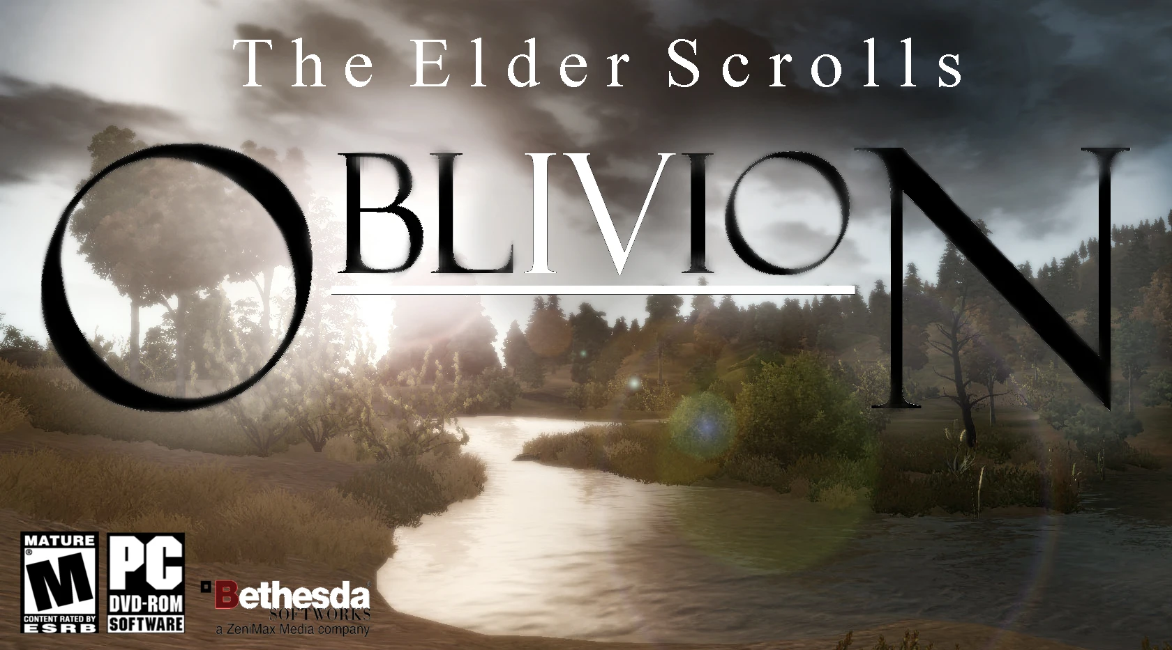
Just a little something I made.. Which do you think would sell better? This? Or the default cover?
=======
I'd like to share a bit of an old pet peeve of mine: Ever since I picked up this game back in 2007-ish, the layout of the title bothered me. 'Oblivion' has within it the letters 'i' and 'v' in perfect consecutive order. Not only that, but the word itself would remain symmetrical having eight letters (three on each side of the 'i' and 'v'). ...That's my OCD at work.


5 comments
views already XD. Google must have been sent their crawlers along
--
Nothing to add, but: let them keep coming: you do not need to _make_ fans;
but you can please them
--
But it is interesting, isn't it: The scales do lower a bit towards the right
side of the image, for the given reasons. Woah: that's tricky stuff. That's
why they made a plain black cover with golden letters printed on it (for
the GOTY edition, at least; btw with mixed case letters, and three different fonts
for three lines of text).
Also, that's some really nice advice, Tesa
'Cause of the typography. There are several minor issues that could be fixed and polished easily (spacing, the N looks bigger than the O, caps / lowercase mix etc) and one major: it's hard to read on the first look.
Second problem is that the (beautiful) picture draws even more attention from the title as it holds too much detail (lens flare, trees behind the O cut over the font shapes). Last, when thelook follows the shapes and lines in the picture, it ends in an open lower right and is "washed" out of the picture.
Overall I like the idea, the clearly outstanding IV (I suspect that was the reason for the zoom-in in the main menu), and I like simplicity in logos, the heath / swamp landscape, and neat light effects with small color range and low saturation. The latter personally - it does not work good on most game covers and hints more towards the mystery / crime genre than to an RPG. Skyrim works there thanks to its cold colors and dark atmosphere. The same works not for Oblivion with these (beautiful!) reddish colors.
And I should stop now before more coffee-induced art director blurb happens ... most of all after my really bad River Niben ad.
This is a good idea pinned down, polishing would be simply work from here.